
Why Your Poster Prints Never Look Like Your Screen And How to Fix It Before You Print

Updated: Sep 29
Written by the Creffield Digital Print team, Melbourne · Reviewed for accuracy September 2026 · Drawing on our day-to-day experience printing posters from A3 to A0 for artists, designers, and businesses across Melbourne and Geelong.
You spent hours getting the colours right. The design looked perfect on screen vibrant, sharp, exactly what you wanted.
Then the printed poster arrived. Flatter. Duller. A little off.
Nothing was wrong with the file. Nothing was wrong with the printer. But something got lost between your screen and the paper and it happens to artists, designers, and business owners every day.
Here's why it happens, and exactly what to do before you use any poster printing service.

CMYK or RGB for Printing Posters? The Short Answer
Design and export your poster in CMYK. Use RGB only for things people will view on a screen, like websites and social media.
That's the safe default for almost every poster job. There is one nuance worth knowing: some large-format inkjet printers use more than four inks and convert RGB files through colour profiles, so a few print workflows accept RGB. Every printer's setup is different, so if you're unsure, ask which colour mode they prefer before you send the file. When in doubt, CMYK is the choice that avoids surprises.
The Real Reason Your Colours Look Different in Print
The short answer: your screen and your printer speak completely different colour languages.
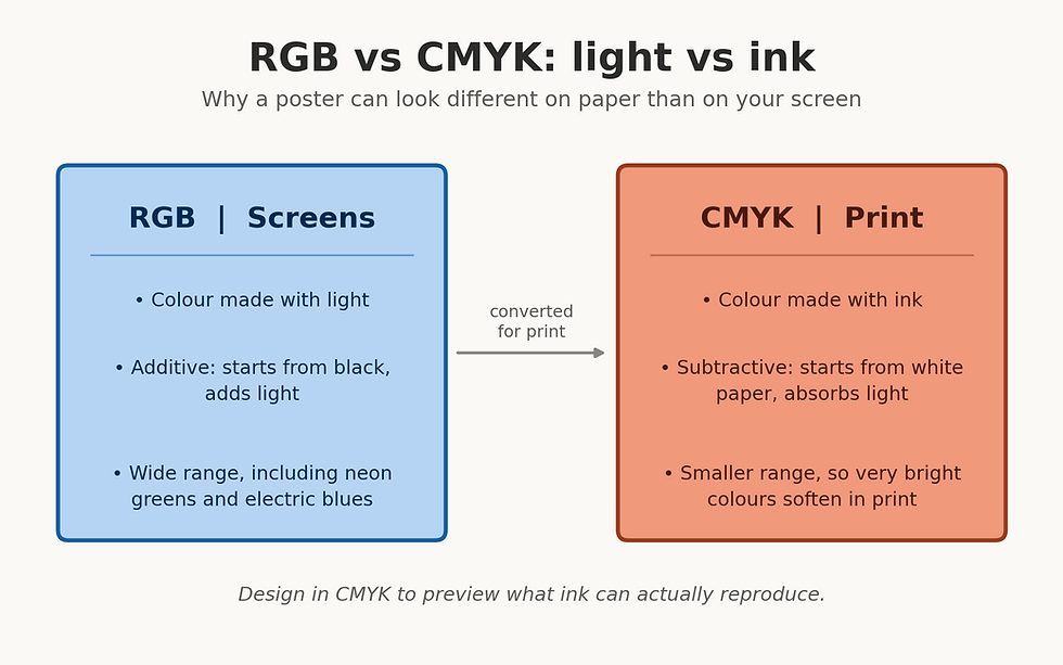
Your screen uses RGB. That stands for Red, Green, Blue three colours of light mixed together to produce every colour you see on a monitor, phone, or tablet. RGB is an additive system. It starts with black (no light) and adds light to create colour. The more light it adds, the brighter and more vivid the result.
Your printer uses CMYK. That stands for Cyan, Magenta, Yellow, and Black four inks layered onto white paper. CMYK is a subtractive system. It starts with white (the paper) and absorbs light using ink. The more ink, the darker the result.
These two systems don't cover the same range of colours. RGB can produce colours that CMYK simply cannot replicate with ink certain electric blues, neon greens, and vivid oranges exist on screen but have no ink equivalent. When your RGB file goes to print, those colours shift to the closest printable match.
That shift is the gap you're seeing.
Which Colours Shift the Most
Not every colour changes equally. Ordinary reds, browns, and muted tones usually convert with little visible change. The colours to watch are the bright, highly saturated ones:
Colour on screen | What often happens in print | What to do |
Electric or bright blue | Can turn duller, or drift toward purple if the CMYK mix carries too much magenta | Check the CMYK values after converting and adjust by hand |
Neon or vivid green | Softens noticeably | Choose a slightly deeper green that inks can reproduce |
Bright orange | Can look flatter | Compare against a printed swatch or test print |
Very deep, saturated colours | Can lose punch | Preview in CMYK before final approval |
How to Fix It Before You Use a Poster Printing Service
The single most effective thing you can do is design or convert your file in CMYK before submitting it to any poster printing service.
Here's how to do it in the most common design tools:
Adobe Photoshop: Image → Mode → CMYK Colour
Adobe Illustrator: File → Document Colour Mode → CMYK
Affinity Designer: Document → Colour Format → CMYK
After converting, your design will look slightly more muted on screen. That's not a problem that's accuracy. You're now seeing a realistic preview of what ink on paper will produce.
If your colours shift dramatically after converting, it means your original design relied heavily on colours that only exist in RGB. Adjust those colours manually within CMYK, and you'll have far more control over the final result.
Tip for large areas of black: on a poster, a big black background printed with black ink alone can look flat. Many designers use a "rich black" (black plus some cyan, magenta, and yellow) for large solid areas, and plain black for small text and fine lines where crisp edges matter. Ask your printer which rich black mix suits their equipment.
Is Your Monitor Showing You the Truth?
Even with a correctly converted CMYK file, your monitor can still mislead you.
Most consumer screens including many professional-grade monitors are factory-set to display colours that are brighter and more saturated than real life. They're designed to look impressive, not to simulate ink on paper.
An uncalibrated monitor causes two common problems:
Prints come back darker than expected — because your screen was set too bright, so your design looked lighter than it actually was
Colours look washed out in print — because your screen was boosting saturation that ink cannot replicate
The solution is monitor calibration. Tools like the X-Rite ColorChecker or Datacolor Spyder adjust your screen to a standardised reference point, so what you see is genuinely close to what will print.
Not ready to invest in calibration hardware yet? A quick workaround: reduce your monitor brightness by around 30 percent before you assess your design. It won't be perfect, but it gives you a much more honest preview of the printed result.
The Other Two Factors That Catch People Out
Colour mode and monitor calibration solve most screen-to-print problems. But two more variables are worth checking before every order.
Resolution
Screens display at 72–96 dots per inch (DPI). Print requires a minimum of 300 DPI at the final output size.
An image that looks sharp on screen at 72 DPI will print soft and blurry. Always confirm your resolution before submitting to any poster printing service especially if you're using photos or stock images pulled from the web.
Larger posters make this more demanding, because the same image has to stretch across a bigger area. Our poster printing guide covering sizes, paper, and costs walks through how to match file setup to each size.
Paper Finish
The finish you choose changes how colour reads in person more than most people expect.
Finish | How Colour Reads | Best Used For |
Gloss | Bold, high contrast | Events, retail, promotions |
Matte | Soft, refined | Fine art, photography, exhibitions |
Satin | Balanced, natural | Business signage, general use |
Gloss amplifies colour and contrast great for grabbing attention from a distance. Matte absorbs more light and produces a quieter, more considered result better for artwork and anything viewed up close. Satin is the all-rounder.
Choosing the right finish for your design intent is as important as getting the colour right. If you're also weighing up size, see A0 vs A1 vs A2 Posters: Which Size Should You Choose?
Your Pre-Print Checklist
Here is everything above in one place. Run through it before every order.

One Step That Removes the Guesswork Entirely
Even when you've done everything right CMYK file, calibrated monitor, 300 DPI, correct paper finish colour can still surprise you across different paper types and print environments.
The most reliable way to confirm your result before committing to a full order is a test print.
A test print shows you exactly how your file translates to the specific paper and finish you've chosen, before you spend money on a full run. For artists reproducing original work, designers presenting to clients, and businesses putting their brand on a wall, it's the step that turns a hopeful outcome into a confident one.
According to the International Colour Consortium, maintaining accurate colour profiles across devices is the foundation of predictable, consistent print results and a test print is the most practical way to verify that in the real world.
Print With Confidence — Not Crossed Fingers
Getting colour right between screen and paper isn't complicated once you know what to check. Convert to CMYK. Calibrate your monitor. Set your resolution to 300 DPI. Choose the right finish. And proof it with a test print before the full run.
These steps will save you time, money, and the frustration of a poster that almost looks right.
Creffield Digital Print offers professional poster printing services across Melbourne and Geelong, including test prints on a full range of paper types and finishes. Whether you're an artist, designer, or business, our team is here to make sure your work looks exactly as you intended — in hand, not just on screen.
Frequently Asked Questions
Should I use CMYK or RGB for printing posters?
CMYK is the safe default for posters. RGB is best for anything viewed on a screen. Some large-format inkjet workflows accept RGB files, so check your printer's preference if you're unsure.
Why do my printed colours look duller than my screen?
Screens create colour with light and can show very bright, saturated shades that ink cannot reproduce. When a file is converted to CMYK, those shades shift to the nearest printable colour, which often looks duller.
Will converting to CMYK change how my design looks?
Slightly, yes. Bright blues, greens, and oranges are the most likely to soften. That change is a realistic preview of the print, which is why converting before you finalise the design is worth doing.
Do I need to calibrate my monitor?
It isn't essential, but it helps. Many screens are set brighter and more saturated than real life. Calibration tools give a reliable reference point, and lowering brightness by around 30 percent is a simple stopgap.
What is the best way to check colour before a big print run?
Order a test print on the exact paper and finish you plan to use. It shows how your file translates in real life before you commit to the full run.
Sources & Further Reading
International Colour Consortium — colour management and ICC profiles
RGB vs CMYK: What's the Difference? — Vistaprint guide to file formats, colour shifts, and rich black
RGB vs CMYK: Colour guide for printing success — Printful guide to colour models and the printable range


Comments